import requests
from bs4 import BeautifulSoup
import pandas as pd
import numpy as np
import time
import seaborn as sns
import matplotlib.pyplot as plt

%matplotlib inline
1. Getting the data
# Get all the links to the gamelogs for Jordan

url = 'https://www.basketball-reference.com/players/j/jordami01.html'
response = requests.get(url)
soup = BeautifulSoup(response.content, 'html.parser')

table = soup.find(id="per_game")
links = table.findAll('a', href=re.compile('gamelog'))
# Extract all the gamelogs from all the links and create dataframe
dfs=[]
base_url = 'https://www.basketball-reference.com'
for link in links:
df = pd.read_html(base_url+link['href'], attrs={'id': 'pgl_basic'})[0]
dfs.append(df)
time.sleep(3.2)
result = pd.concat(dfs, ignore_index=True)
result.head()| Rk | G | Date | Age | Tm | Unnamed: 5 | Opp | Unnamed: 7 | GS | MP | ... | DRB | TRB | AST | STL | BLK | TOV | PF | PTS | GmSc | +/- | |
|---|---|---|---|---|---|---|---|---|---|---|---|---|---|---|---|---|---|---|---|---|---|
| 0 | 1 | 1 | 1984-10-26 | 21-252 | CHI | NaN | WSB | W (+16) | 1 | 40:00 | ... | 5 | 6 | 7 | 2 | 4 | 5 | 2 | 16 | 12.5 | NaN |
| 1 | 2 | 2 | 1984-10-27 | 21-253 | CHI | @ | MIL | L (-2) | 1 | 34:00 | ... | 2 | 5 | 5 | 2 | 1 | 3 | 4 | 21 | 19.4 | NaN |
| 2 | 3 | 3 | 1984-10-29 | 21-255 | CHI | NaN | MIL | W (+6) | 1 | 34:00 | ... | 2 | 4 | 5 | 6 | 2 | 3 | 4 | 37 | 32.9 | NaN |
| 3 | 4 | 4 | 1984-10-30 | 21-256 | CHI | @ | KCK | W (+5) | 1 | 36:00 | ... | 2 | 4 | 5 | 3 | 1 | 6 | 5 | 25 | 14.7 | NaN |
| 4 | 5 | 5 | 1984-11-01 | 21-258 | CHI | @ | DEN | L (-16) | 1 | 33:00 | ... | 2 | 5 | 5 | 1 | 1 | 2 | 4 | 17 | 13.2 | NaN |
5 rows × 30 columns
# Save the dataframe to a csv file

result.to_csv('jordan.csv', index=False)
# Load the data
result = pd.read_csv('jordan.csv')2. Clean the data + basic feature eng’
# Check Dtypes

result.info()
<class 'pandas.core.frame.DataFrame'>
RangeIndex: 1135 entries, 0 to 1134
Data columns (total 30 columns):
# Column Non-Null Count Dtype
--- ------ -------------- -----
0 Rk 1135 non-null object
1 G 1121 non-null object
2 Date 1135 non-null object
3 Age 1135 non-null object
4 Tm 1135 non-null object
5 Unnamed: 5 545 non-null object
6 Opp 1135 non-null object
7 Unnamed: 7 1086 non-null object
8 GS 1135 non-null object
9 MP 1135 non-null object
10 FG 1135 non-null object
11 FGA 1135 non-null object
12 FG% 1135 non-null object
13 3P 1135 non-null object
14 3PA 1135 non-null object
15 3P% 805 non-null object
16 FT 1135 non-null object
17 FTA 1135 non-null object
18 FT% 1105 non-null object
19 ORB 1135 non-null object
20 DRB 1135 non-null object
21 TRB 1135 non-null object
22 AST 1135 non-null object
23 STL 1135 non-null object
24 BLK 1135 non-null object
25 TOV 1135 non-null object
26 PF 1135 non-null object
27 PTS 1135 non-null object
28 GmSc 1135 non-null object
29 +/- 335 non-null object
dtypes: object(30)
memory usage: 266.1+ KB# Drop unnecessary rows
result.drop(result[result.Date == "Date"].index, inplace=True)
result.drop(result[result.PTS == "PTS"].index, inplace=True)
result.drop(result[result.PTS == "Did Not Dress"].index, inplace=True)
result.drop(result[result.PTS == "Not With Team"].index, inplace=True)
# Convert the 'Date' column to a datetime object
result['Date'] = pd.to_datetime(result['Date'])
# Convert PTS to int
result['PTS'] = result['PTS'].astype(int)
# Split the MP column on ':' and keep the first element
result['MP'] = result['MP'].str.split(':').str[0]
# Convert the MP column to float
result['MP'] = result['MP'].astype(float)
# Convert Goals % to float
result['FG%'] = result['FG%'].astype(float)
result['3P%'] = result['3P%'].astype(float)
# Convert other stats to correct dtype
result['TRB'] = result['TRB'].astype(int)
result['AST'] = result['AST'].astype(int)
result['STL'] = result['STL'].astype(int)
result['BLK'] = result['BLK'].astype(int)
result['FGA'] = result['FGA'].astype(int)
result['FTA'] = result['FTA'].astype(int)
result['GmSc'] = result['GmSc'].astype(float)
# Fix the Age column
result['Age'] = result['Age'].str.split('-').str[0]
result['Age'] = result['Age'].astype(int)
# Keep only Jordan's seasons with the Bulls
result.drop(result[result.Tm == 'WAS'].index, inplace=True)
# Create a Season column
result['Season'] = result['Date'].apply(lambda x: str(x.year-1) + '-' + str(x.year)[2:] if x.month < 10 else str(x.year) + '-' + str(x.year+1)[2:])3. Visualize
# How many games did Jordan play in each season?

# Group the data by season and count games
games_played = result.Season.value_counts().sort_index()

fig = plt.figure(figsize=(10, 5))

# Create a bar plot
plt.bar(games_played.index, games_played.values)
plt.title("Jordan's Total Games Played by Season")
plt.xlabel('Season')
plt.ylabel('Games Played')
plt.xticks(rotation=45)

plt.show()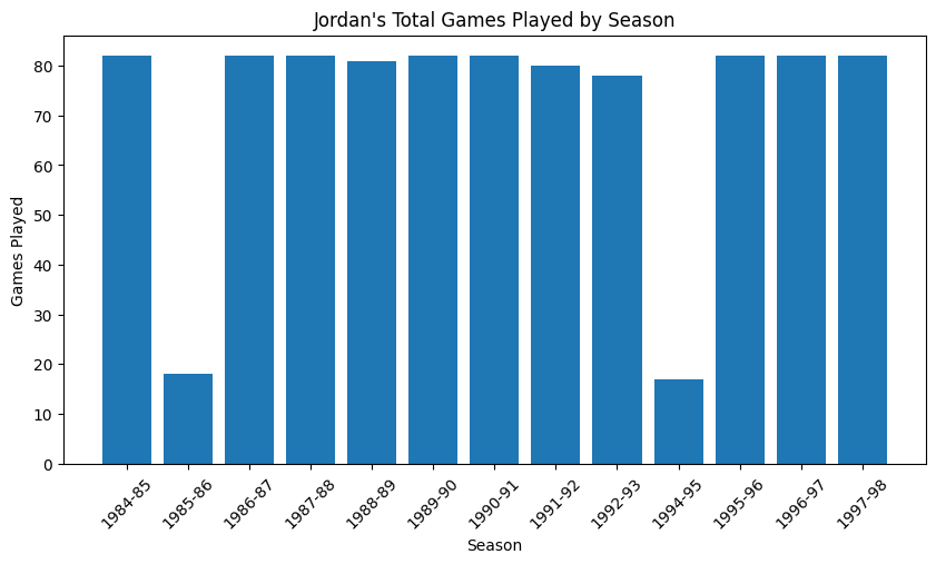
# How many minutes did Jordan play in each season?

# Group the data by season and sum the minutes
minutes_played = result.groupby('Season')['MP'].apply(lambda x: x.sum() / len(x))

fig = plt.figure(figsize=(10, 5))

# Create a bar plot
plt.bar(minutes_played.index, minutes_played.values)
plt.title("Jordan's Average Minutes Played by Season")
plt.xlabel('Season')
plt.ylabel('Average Minutes')
plt.xticks(rotation=45)

plt.show()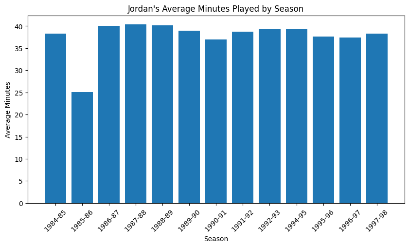
# How much did he score in each season?

# Group the data by season and calculate the average points per game
season_avg_pts = result.groupby('Season')['PTS'].mean()

fig = plt.figure(figsize=(10, 5))

# Create a line plot
plt.plot(season_avg_pts.index, season_avg_pts.values, marker='o')
plt.title("Jordan's Average Points per Game by Season")
plt.xlabel('Season')
plt.ylabel('Average Points per Game')
plt.xticks(rotation=45)

plt.show()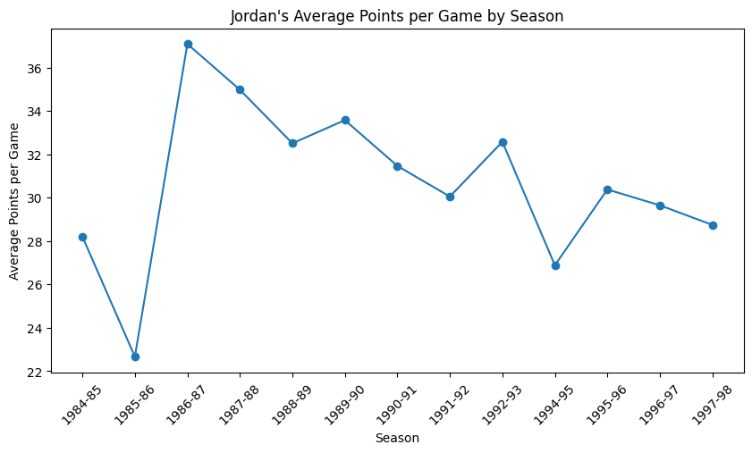
# How many games did Jordan play in each season - box plot

sns.set_style('whitegrid')

fig = plt.figure(figsize=(10, 5))

sns.boxplot(x='Season', y='PTS', data=result)

plt.title("Jordan's Points by Season")
plt.xlabel('Season')
plt.ylabel('Points')
plt.xticks(rotation=45)

plt.show()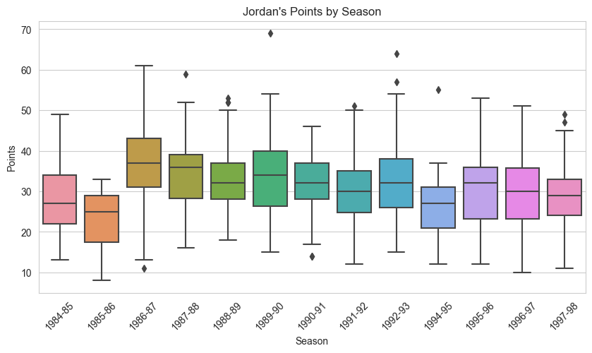
# How does his scores looks like along his career?

# Define the bin edges
bins = [i for i in range(0, 71, 10)]

fig = plt.figure(figsize=(10, 5))

plt.hist(result['PTS'], bins=bins, edgecolor='black')

plt.title("Jordan's Career Points Frequency")
plt.xlabel('Points')
plt.ylabel('Frequency')

plt.show()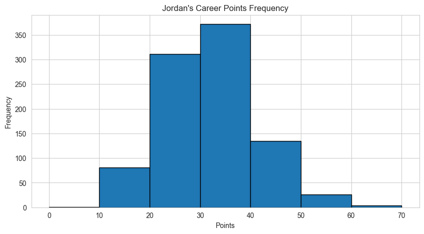
# Calculate FG% and 3P% for each season

fg_pct_by_season = result.groupby('Season')['FG%'].mean()
three_pct_by_season = result.groupby('Season')['3P%'].mean()

fig = plt.figure(figsize=(10, 5))

# Create a multi-line plot
plt.plot(fg_pct_by_season.index, fg_pct_by_season.values * 100, label='Field goals %')
plt.plot(three_pct_by_season.index, three_pct_by_season.values * 100, label='3 point %')
plt.title("Jordan's Field Goal Percentage and Three-Point Percentage by Season")
plt.xlabel('Season')
plt.ylabel('Percentage')
plt.xticks(rotation=45)
plt.legend()

plt.show()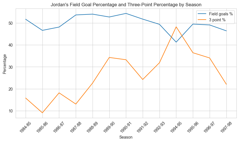
# Create a density plot of Jordan's points per game

fig = plt.figure(figsize=(10, 5))

sns.kdeplot(data=result, x="PTS", hue="Season", fill=True, alpha=0.5, common_norm=False, palette='tab20')

plt.title("Distribution of Jordan's Points per Game by Season")
plt.xlabel("Points per Game")
plt.ylabel("Density")

plt.show()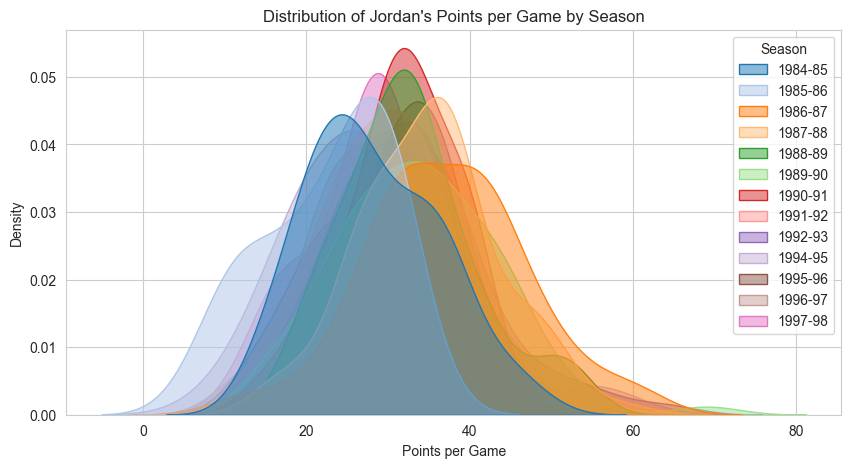
# Calculate average points per opponent
avg_pts_by_opp = result.groupby('Opp')['PTS'].mean().sort_values()

fig, ax = plt.subplots(figsize=(8, 8))
ax.barh(avg_pts_by_opp.index, avg_pts_by_opp.values, color='blue')

ax.set_title("Jordan's Average Points by Opponent")
ax.set_xlabel('Average Points')
ax.set_ylabel('Opponent')

plt.show()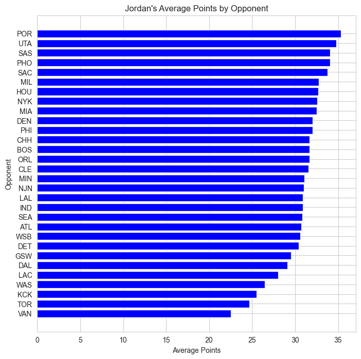
# What was his True Shooting Percentage (TS%)? (formula from the internet)

result['TS%'] = result['PTS'] / (2 * (result['FGA'] + 0.44 * result['FTA']))

# Calculate true shooting percentage for each season
ts_pct_by_season = result.groupby('Season')['TS%'].mean()

fig = plt.figure(figsize=(10, 5))

# Create a line plot
plt.plot(ts_pct_by_season.index, ts_pct_by_season.values * 100)

plt.title("Jordan's True Shooting Percentage by Season")
plt.xlabel('Season')
plt.ylabel('True Shooting %')
plt.xticks(rotation=45)

plt.show()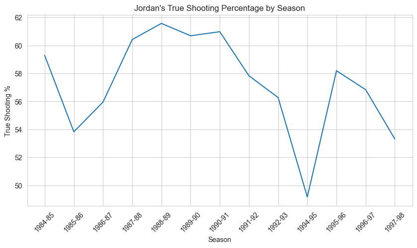
# Group the data by season and sum the defensive stats
defensive_stats_by_season = result.groupby('Season')[['TRB', 'AST', 'STL', 'BLK']].sum()

# Create a stacked bar plot
defensive_stats_by_season.plot(kind='bar', stacked=True, figsize=(10, 5))

plt.title("Jordan's Defensive Stats by Season")
plt.xlabel('Season')
plt.ylabel('Total')
plt.xticks(rotation=45)
plt.legend(['Rebounds', 'Assists', 'Steals', 'Blocks'])

plt.show()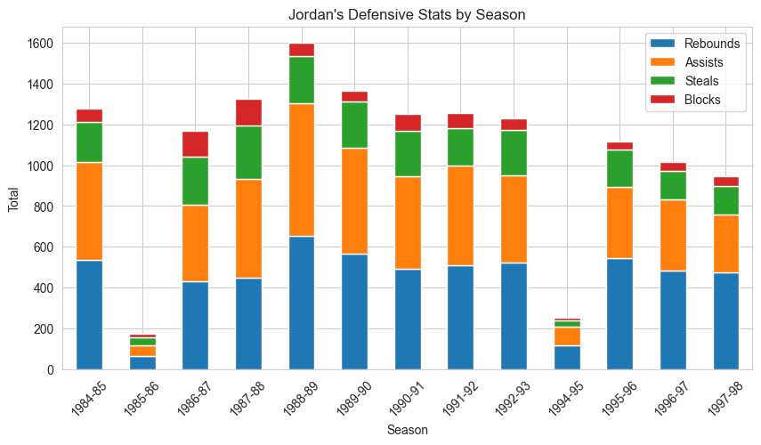
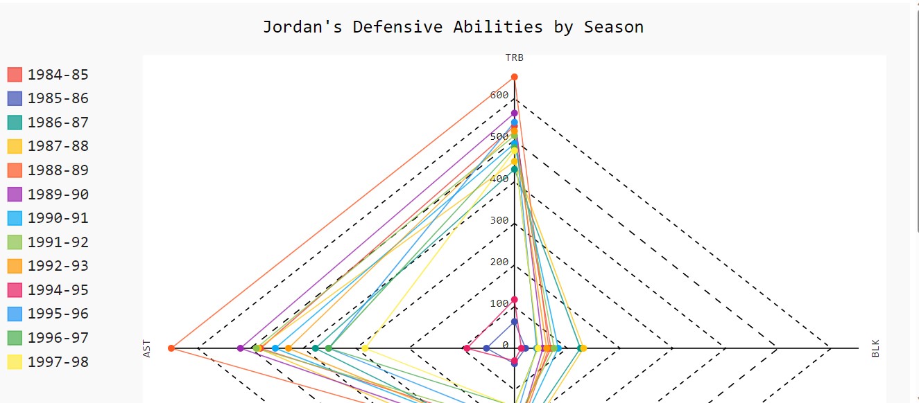
import pygal

# Create a radar chart
radar_chart = pygal.Radar()
radar_chart.title = "Jordan's Defensive Abilities by Season"

# Add the defensive statistics as axes to the chart
radar_chart.x_labels = ['TRB', 'AST', 'STL', 'BLK']
for season in defensive_stats_by_season.index:
    radar_chart.add(season, list(defensive_stats_by_season.loc[season]))

# Render the chart
radar_chart.render_in_browser()file://C:/Users/nisan/AppData/Local/Temp/tmp9_pao9ut.htmlThis will open in your browser:
The following two plots can not be displayed in this website… you can use them on your machine.
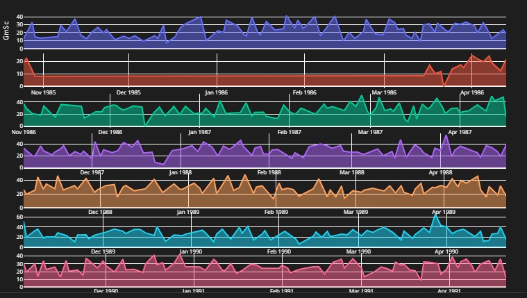
# His "game score" along the seasons.
"""
Game Score = Points Scored + (0.4 x Field Goals) –
(0.7 x Field Goal Attempts) – (0.4 x (Free Throw Attempts – Free Throws)) +
(0.7 x Offensive Rebounds) + (0.3 x Defensive Rebounds) + Steals + (0.7 x Assists) +
(0.7 x Blocks) – (0.4 x Personal Fouls) – Turnovers

From: https://captaincalculator.com/sports/basketball/game-score-calculator/
"""

import plotly.graph_objs as go
from plotly.subplots import make_subplots

# Get the unique seasons
seasons = result['Season'].unique()

# Create the subplot grid
fig = make_subplots(rows=len(seasons), cols=82, shared_yaxes=True,
                    horizontal_spacing=0.01, vertical_spacing=0.01)

# Loop through each season and add the trace to the corresponding subplot
for i, season in enumerate(seasons):

    season_data = result[result['Season'] == season]

    trace = go.Scatter(x=season_data['Date'], y=season_data['GmSc'], mode='lines', fill='tozeroy',
                       showlegend=False)

    fig.add_trace(trace, row=i+1, col=1)

    fig.update_layout(height=800, width=300000, title="",
                      xaxis_title='', yaxis_title='GmSc',
                      xaxis=dict(tickvals=[], ticktext=[]),
                      margin=dict(l=0, r=0, t=30, b=0, pad=0),
                      paper_bgcolor='rgba(0,0,0,0)', plot_bgcolor='rgba(0,0,0,0)',
                      font=dict(color='#FFFFFF', size=8))

fig.update_xaxes(title_text='Date', row=len(seasons), col=1)

fig.show()
Unable to display output for mime type(s): application/vnd.plotly.v1+jsonIt looks like that:
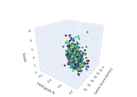
import plotly.graph_objs as go

result['Opp'] = result['Opp'].astype('category')
result['Opp_codes'] = result['Opp'].cat.codes


# Create the trace
trace = go.Scatter3d(
    x=result['GmSc'],
    y=result['FG%'],
    z=result['STL'],
    mode='markers',
    marker=dict(
        color=result['Opp_codes'],
        colorscale='Viridis',
        size=5,
        opacity=0.8,
    ),
    text=result['Opp'],
    name='Jordan'
)

# Create the layout
layout = go.Layout(
    title='Jordan Performance',
    scene=dict(
        xaxis=dict(title='Game Score (GmSc)'),
        yaxis=dict(title='Field goals %'),
        zaxis=dict(title='Steals'),
    ),
    margin=dict(l=0, r=0, b=0, t=50),
    legend=dict(
        title='',
        font=dict(
            size=10,
        )
    )
)

fig = go.Figure(data=[trace], layout=layout)
fig.show()
Unable to display output for mime type(s): application/vnd.plotly.v1+jsonAnd this one looks like that: