pip install spotipyIntroduction
Spotify has a fantastic API enabling you to connect to its huge music database. With Spotify’s API, you can get insights about the music you listen to, use a powerful search engine, get access to Spotify’s amazing recommendation system, and integrate Spotify’s features into your apps.
Prerequisites
First, we’ll have to sign up at the official Spotify Developer Portal, head over to the Dashboard and get our ClientID and Client Secret. We’ll also have to register a redirect URI to our app (navigate to your application and then [Edit Settings]). The redirect URI can be any valid URI (it does not need to be accessible) such as http://example.com. We’ll use Spotipy, which is a lightweight Python library for the Spotify Web API.
If this is the first time you use it, you’ll have to install it with
Next, let’s import some necessary packages:
from spotipy.oauth2 import SpotifyOAuth
import spotipy
import pandas as pd
import matplotlib.pyplot as plt
import seaborn as sns

%matplotlib inline
We should declare the important details for the API:
client_id = "********"
client_secret = "*********8"
redirect_uri = "http://localhost:1234"
Getting our top songs
Now we can write the API code that will fetch us our top songs and their attributes:
oauth_scopes="user-top-read"
t_range = "long_term"

auth_manager = SpotifyOAuth(client_id=client_id,
                                               client_secret=client_secret,
                                               redirect_uri=redirect_uri,
                                               scope=oauth_scopes)
sp = spotipy.Spotify(auth_manager=auth_manager)

user_top_tracks = sp.current_user_top_tracks(limit=50, time_range=t_range)
This fetches us A LOT of data. We can organize the important details in a dictionary:
top_tracks = {"track":[],"album":[],"artist":[],"ID":[],"popularity":[],"release_date":[],"duration_ms":[], "artist_id":[]}

for i in user_top_tracks["items"]:

    top_tracks["track"].append(i['name'])
    top_tracks["album"].append(i['album']['name'])
    top_tracks["artist"].append(i['artists'][0]['name'])
    top_tracks["ID"].append(i['id'])
    top_tracks["popularity"].append(i['popularity'])
    top_tracks["release_date"].append(i['album']['release_date'])
    top_tracks["duration_ms"].append(i['duration_ms'])
    top_tracks["artist_id"].append(i['artists'][0]['id'])
and convert the dictionary into a pandas dataframe:
df = pd.DataFrame.from_dict(top_tracks) Let’s send another API call to get the attributes of our top tracks:
audio_analysis = sp.audio_features(df['ID'].tolist())and convert it to a dataframe:
df2 = pd.DataFrame.from_dict(audio_analysis) which we will merge with the previous dataframe:
df_full = pd.merge(df, df2, how='inner', left_on = 'ID', right_on = 'id')By now we have a nice dataframe of our top tracks and their musical attributes. Let’s send another API call to get the genres of our favorite artists, and combine them into our dataframe:
genres = []

for artist in df_full['artist_id']:
    genres.append(sp.artist(artist)['genres'])

df_full['genres'] = genres

df_full.head()
This dataframe looks like that (with your music..): 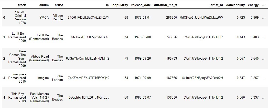
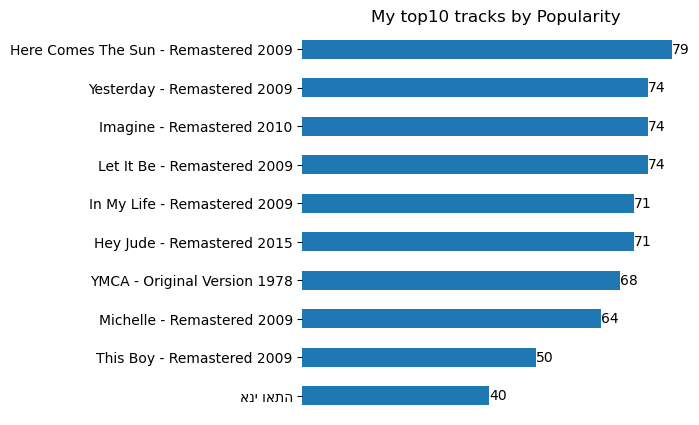
That’s a lot of data. Let’s plot our top ten tracks by popularity:
ax = df_full.iloc[:10].sort_values(by='popularity').plot(x='track', y='popularity', kind ="barh", figsize=(5, 5))
ax.get_xaxis().set_visible(False)
ax.get_legend().remove()
ax.spines['top'].set_visible(False)
ax.spines['right'].set_visible(False)
ax.spines['bottom'].set_visible(False)
ax.spines['left'].set_visible(False)

plt.ylabel("")

plt.title('My top10 tracks by Popularity')

plt.bar_label(ax.containers[0])
plt.legend
plt.show()
These are my top 10. Yeah…. I know 😂
We can also plot our top artists:
data = df_full['artist'].value_counts(normalize=True) * 100

ax = data.sort_values().plot(kind="barh", figsize=(7, 3))
ax.get_xaxis().set_visible(False)

ax.spines['top'].set_visible(False)
ax.spines['right'].set_visible(False)
ax.spines['bottom'].set_visible(False)
ax.spines['left'].set_visible(False)

plt.title('My top Artists (%)')
plt.bar_label(ax.containers[0], fmt='%.0f%%')
plt.show()
Which, in my case, looks like that: 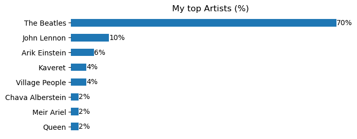
Plotting our songs attributes is a little tricky:
df_attributes = df_full[['danceability', 'energy', 'key', 'loudness', 'mode'
       'speechiness', 'acousticness', 'instrumentalness', 'liveness',
       'valence']]


for column in df_attributes.columns:
    df_attributes[column] = df_attributes[column]  / df_attributes[column].abs().max()


ax = df_attributes.mean().sort_values(ascending=True).plot(kind="barh", figsize=(20, 10), )
ax.get_xaxis().set_visible(False)

ax.spines['top'].set_visible(False)
ax.spines['right'].set_visible(False)
ax.spines['bottom'].set_visible(False)
ax.spines['left'].set_visible(False)

plt.title('My top songs attributes (normalized)').set_size(25)
plt.bar_label(ax.containers[0])
plt.show()
We normalize the data to be able to compare the different attributes. We can also plot a heatmap of the attributes of our top songs with Seaborn:
df_attributes['track'] = df_full['track']

plt.figure(figsize = (22,22))

sns.heatmap(df_attributes.set_index('track'), annot=True, linewidths=.5, cmap="RdYlGn")

plt.title("Attributes of my top tracks").set_size(40)
The heatmap helps us understand our musical taste:
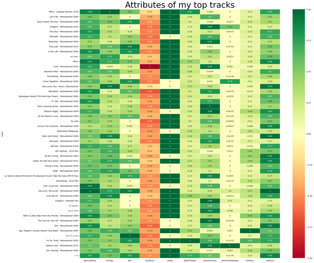
It looks like my popular songs are more “danceable” and feature more “valence”. They also have almost zero “instrumentality” and little “liveness”. Let’s see what our favorite genres are:
flat_list = [item for sublist in df_full['genres'].tolist() for item in sublist]

x = pd.Series(flat_list)

data = x.value_counts(normalize=True) * 100
plot = data.plot.pie(y=data.values.tolist(), figsize=(5, 5), autopct='%.2f')
plt.ylabel("")

plt.title('My top Genres (%)')
plt.show()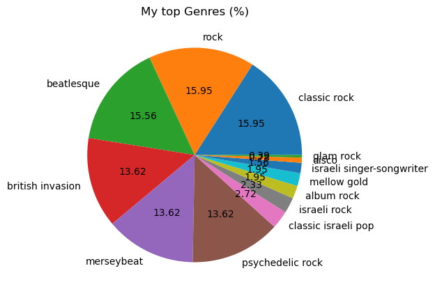
We can plot it using a wordcloud:
from wordcloud import WordCloud
from wordcloud import ImageColorGenerator
from wordcloud import STOPWORDS

wc = WordCloud(width=800, height=400, max_words=200).generate_from_frequencies(data)

plt.figure(figsize=(10, 10))
plt.imshow(wc, interpolation='bilinear')
plt.title('My top Genres')
plt.show()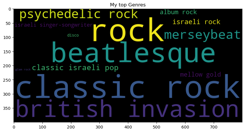
Conclusion
In this post, I gave a brief overview of Spotify Web API’s methods using Spotipy and showed how the data from Spotify can be investigated and visualized. My next step would be to build my recommendation system data from Spotify. Stay tuned 😊
The notebook with code from this article is available here.